+91 9787303699
 contact@amazefox.com
+91 9787303699
contact@amazefox.com
contact@amazefox.com
+91 9787303699
contact@amazefox.com
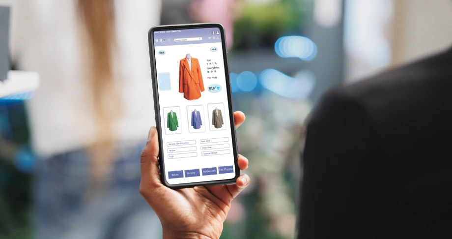
The way people shop online has changed dramatically over the past decade. Today, most consumers browse
products, compare prices, and make purchases directly from their smartphones. As mobile usage continues to
grow, businesses must adapt by prioritizing mobile experiences. This is where mobile-first design becomes
essential for e-commerce success.
Mobile-first design is an approach where websites are designed for mobile devices before being adapted for
larger screens. By focusing on mobile users first, businesses can create faster, more user-friendly, and
conversion-focused shopping experiences.
Mobile-first design starts with designing the website for smaller screens and then progressively enhancing
it for tablets and desktops. Instead of shrinking a desktop website to fit a mobile screen, the design is
built specifically for mobile users from the beginning.
This approach ensures that the most important content, features, and user interactions are optimized for the
devices customers use most often.
1. Most Online Shoppers Use Mobile Devices
Consumers increasingly rely on smartphones for online shopping. Whether they're browsing products during a
commute or making purchases from home, mobile devices have become a primary shopping channel.
A mobile-first website ensures that customers enjoy a seamless shopping experience regardless of
where they are.
2. Improves User Experience
User experience is one of the biggest factors influencing online sales. Mobile-first design focuses on:
When customers can quickly find products and complete purchases, they are more likely to return.
3. Increases Conversion Rates
A complicated mobile experience often leads to abandoned carts and lost sales. Mobile-first design removes
friction by creating streamlined shopping journeys that guide users from product discovery to
checkout.
The easier it is to shop, the higher the chances of conversion.
4. Enhances Website Performance
Mobile-first websites are typically designed with performance in mind. Optimized images, clean layouts, and
lightweight code help pages load faster.
Faster websites not only improve customer satisfaction but also reduce bounce rates and increase engagement.
5. Supports Search Engine Rankings
Search engines prioritize mobile-friendly websites when ranking search results. A mobile-first approach
helps businesses improve their visibility and attract more organic traffic.
Better rankings mean more potential customers discovering your online store.
Responsive Design
The website should adapt seamlessly to different screen sizes and devices.
Simple Navigation
Menus should be easy to access and use on smaller screens.
Fast Loading Speed
Pages should load quickly to keep users engaged.
Mobile-Friendly Checkout
Streamline the purchasing process by reducing unnecessary steps.
Optimized Product Pages
Product images, descriptions, and pricing should be clearly visible without excessive scrolling.
Secure Payment Options
Offer trusted payment methods that work smoothly on mobile devices.
Higher Customer Satisfaction
Customers appreciate websites that are easy to use on mobile devices.
Increased Sales
A smooth mobile shopping experience encourages purchases and reduces cart abandonment.
Better Customer Retention
Satisfied customers are more likely to return for future purchases.
Competitive Advantage
Businesses with superior mobile experiences stand out from competitors.
Improved Brand Reputation
A professional and user-friendly website builds trust and credibility.
Avoiding these mistakes can significantly improve the overall shopping experience.
As technology evolves, businesses are embracing new mobile-first innovations such as:
These advancements are helping businesses create more engaging and convenient shopping experiences for customers.
We hope these questions and answers guide you in choosing the right web design partner for your business’s digital transformation. If you have any more questions, feel free to reach out!

Mobile-first design is a website development approach that prioritizes mobile devices during the design process before adapting the website for larger screens.
Mobile-first design is no longer optional for e-commerce businesses. With consumers relying heavily on
smartphones for online shopping, businesses must prioritize mobile experiences to remain competitive. A
mobile-first approach improves usability, increases conversions, boosts search visibility, and enhances
customer satisfaction.
By investing in a mobile-friendly e-commerce website, businesses can create seamless shopping experiences
that drive sales, build customer loyalty, and support long-term growth.

Email us
support@amazefox.com

+91 9787303699

Teams
nikilfox / amazefox


Copyright 2025 © www.amazefox.com. All Rights Reserved.